


Welcome to Zimo Web
Zimo
11 min read · Oct 26, 2023
Tags of this article:
The Commencement
At long last, the project has been finished. Language falls short in capturing what I’ve been through. Not a midlife apathy, nor a degradation post an enduring combat, but purely and profoundly, an emancipation. As the protracted struggle ceases, the warrior finds sanctuary in the ethereal embrace of the highlands. In this tranquil abode, he begins to contemplate the long walk he has just undergone. He thus articulates his reflection.
I yearned for the power to forge my own freedom, as time, that intangible tether, held me in its relentless grip. Days took me to realize that I was bound by thus invisible chains. Months ago, I began to ponder the significance of this time for me. Was I on the verge of breaking free from a monochrome confinement, poised to step into a realm of vivid hues and possibilities? And yet, does this space exist in reality or within the mind? The answer held little weight, for this fantastical creation had blossomed into my haven of escape, a sanctuary woven from the threads of hope, however fragile, shielding me from the disquieting pressures of reality pressing in from all sides.
Where belongs me? In a distant land where the sun sets, lamps illuminate as if it were still day, and neon lights cast violet hues, coloring the ceaseless thoughts of the night. So many journeys have I embarked upon in the realms of my imagination, journeys that may never find their footing in the stark light of reality; how they have filled the storehouses of my memory! I ask, where belongs me! In the vast, empty expanses of space, I find my canvas; and there, I proceed to craft the dwelling of my dreams, for now and for all eternity.
Yielding, for once, to my innermost yearnings, I surrendered to the relentless blaze of obsession that engulfs me when my focus narrows to a singular point or perhaps two. This flame, incessant, consumes me; it devours my time and frays the edges of my sanity. Yet, paradoxically, it is accompanied by an unwavering enthusiasm that prevails and predominates. In this final act of submission to the flame’s engulfing embrace, fully aware of the uncontrollable descent that must inevitably follow, I commenced this monumental endeavor.
There are those who know the ways of machines and those who do not. Yet, it is imperative that the very sinews of our creations bear the indelible mark of enlightened thought, for it is this that truly encapsulates the ingenuity of humanity. I hence had this philosophy in mind of the crafting. I aimed to achieve the aesthetic while a testament to my limitations.
At long last, emancipation has graced my weary soul. With the chains now shattered apart I am truly ascended from the mental confinement that has tormented me for far too long. Yet this liberation comes at a dire cost, in that my sanity has degraded to the point beyond immediate salvation. As the project has reached its initial completion, I find myself compelled to recline, to gather the remnants of my strength for the ensuing journey, as I recognize that this initial triumph marks but the dawn of my impending fate. Yes, I have emerged from my shackles, reborn and resolute.
The Making of Zimo Web
It took more than a while to complete this project. I shall thus elaborate everything.
Sketchbook, the Beginning
It all began with the simple thought of putting all my stuff together at a unified place, and a website was no better choice. Simple yet effective. It took me a while to build up enough resolve and confidence to finally start this project. After all, college app was not a forgiving matter, and it was supposed to come in priority. Although later I did the opposite. Oops.
The website’s early stages were conceived in an absolutely massive sketchbook. I had to initially rely on a pre-drawn picture rather than conjuring designs directly from my head due to my initial lack of CSS skills (remember I haven’t touched this for a year or so). Sketchbook designs included initial ideas for main page layouts (which have undergone numerous changes), background animations, and certain website settings. The partitioning of album, blog, and projects was also decided in the sketchbook, as I felt these three categories most relevant to me and the website. Scrapped ideas, such as a dark mode for the website, also found a place in the sketchbook. By the time of writing this article, the sketchbook had fallen out of use as the website progressed into its later stages of development. It nevertheless remained a valuable artifact of the creative process.
The Sketchbook.
Side note: the sketchbook was created using Apple’s Freeform app introduced in iOS 16.2. Turned out to be a complete mess and I would definitely recommend Notability over this.
Theme Color and Favicons
The idea of implementing theme colors was solidified even before I had laid down the first design in the sketchbook. I envisioned the website starting in grayscale, gradually introducing palettes of colors as users navigated through different pages. The homepage was thus rendered in grayscale, while the album, blog, and projects sections each featured a distinct color palette derived from the color wheel. The about page was then designed to amalgamate all three theme colors. This strict adherance to specific theme colors on each respective page was consistently upheld throughout the subsequent stages of the website’s design evolution.
One of the earliest elements created was the website’s favicon – a circular emblem embellished with three gradient colors, separated by curved lines. Blue-green, Violet-red, and Orange-yellow were chosen for they are mostly evenly distributed across the color spectrum and exhibit high saturation. Initially, the favicon sported an upside-down teardrop shape without the internal and external boundary lines. This design was eventually deemed to unpleasant, prompting a revision to its present circular form, with no subsequent alterations. Following this, the favicon was recolored to create distinct versions corresponding with the various theme colors on different pages.


Before vs. After.
Dark mode was initially contemplated as a component of the website’s foundational design. Nevertheless, the necessity to integrate theme colors and later, animated backgrounds, transformed the dark mode implementation into a task demanding more than a mere background recolor – it necessitated a comprehensive redesign (as seen in the sketchbook). The enormity of this undertaking eventually led to the abandonment of the dark mode feature entirely, relegating its potential development to the unforseeable future.
Animated Backgrounds
I initially struggled with HTML and CSS since it had been almost a year since I last used these tools. I therefore started with simpler elements like animated backgrounds which depend more on design than implementation. The homepage’s background theme was envisioned as a ‘white desert,’ inspired by a preset layout in the Apple Keynote app. I added animations to the background ‘mountains’ and experimented with layering to make the giant ‘ZIMO’ text appear behind one of the mountains. This concept of displaying my name in giant text stemmed from early design ideas I had months prior, eventually becoming a part of the brainstorming for Zimo Web, and it was definitely not conceived out of narcissism. Although the homepage was the first to receive a background design, its content was the last to be finalized – having just a title and background until about two weeks before writing this article.

Layout from Keynote.
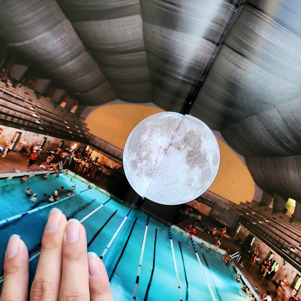
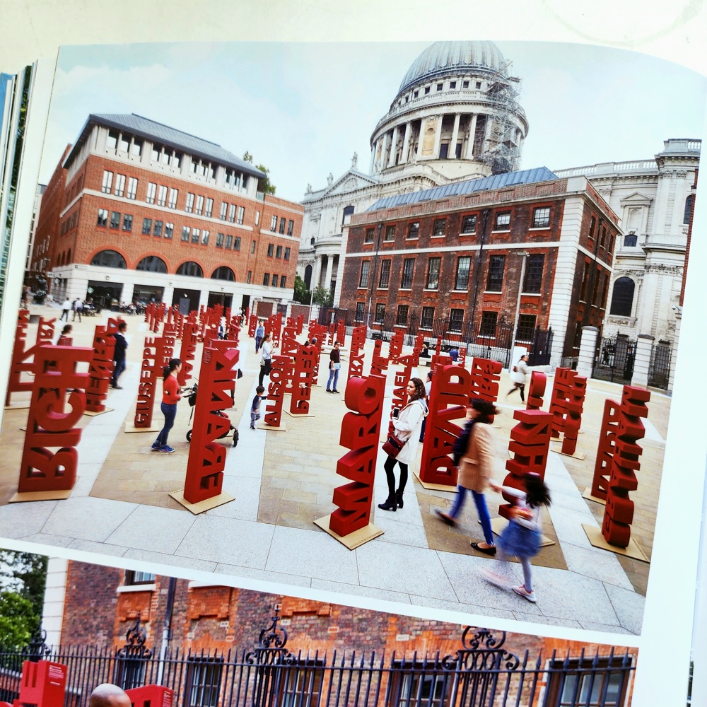
The other pages were meant to feature the three theme palettes, and I opted to add some animated background objects to enhance the mere color. I visited a bookstore seeking architectural design inspiration, believing that website architecture parallels real-life architecture. There, I was heavily influenced by a few designs I found extraordinary: a swimming pool with a giant round image of the moon, a gradient of translucent colored panels stacked atop each other, and vertically aligned text in a plaza. Shadows of these elements can be seen in the animated backgrounds. For the album page, I planned to integrate translucent gradient panels and chose to carve a circle into one to symbolize a camera’s aperture – after all, it is a page dedicated to photos. I added two more with slight variations and subtle animations to prevent monotony. The animations initially experienced a glitch on Safari browsers, presumably due to webkit rendering issues, which was somewhat frustrating. But no worries – they have been resolved now.
The gradient.
For the blog page, its design took inspiration largely from the legacies of this page’s previous incarnation, a blog I had maintained elsewhere. I visualized a large, somewhat luminous orb contrasted by dark shadows beneath it, aiming to showcase key artworks from my prior writings. One of these art pieces, originating from a past post, was also chosen to serve as the blog page’s icon. Presently, three such artworks are featured, with an additional one having been discarded – it was an SVG I asked ChatGPT to generate, and while it certainly stood out, it ultimately felt too clunky for this context, leading to its exclusion. It was during this phase that I thought a unique title text for each page. These titles required on average a minute to conceptualize and were mostly sourced from my prior unused ideas.


The projects page was likely the sole page for which I lacked a definitive vision initially, nor had any background animation concepts until the work began. The whole idea ultimately revolved around a sun-like icon I had crafted roughly a year before, intended as a signature for my project making. I resolved to give this element prominent display and played around with various ideas before settling to make it function like two cogwheels. I fashioned two subtly different versions of the element, reminiscent of the yin and yang symbol, before getting them to spin correctly – it took some time. I also integrated some floating code snippets: given that the majority of my projects are about coding, I aimed to highlight this facet. Thus, I had some play with JavaScript and implemented this feature, even replicating it on my Google search page.

The cogwheels.
Pages and Settings
As the progress shifted to the more interactive parts, buttons inevitably required icons. I initially created most of the icons and buttons in Zimo Web myself, since vector graphics aren’t much of a hurdle in terms of art and creation. However, by the time I began building the comment system, I found drawing every icon to be an overly tedious task. Practically all icons created after that point were sourced from existing public domain content on the internet, with some personal customizations applied.
For several weeks, I focused on developing the blog, projects, and album pages. I encountered a substantial amount of technical debt, as this was essentially my first real introduction to React. There were numerous technical challenges, but they always seemed mundane compared to the design process, so I’ll keep this part brief. The blog page was the first to be created but underwent several overhauls, including the addition of tags, a like button, comments, and a search bar (try out those satisfying animations). For the projects page, I decided to design each project as an ‘app,’ displayed on translucent tiles that are quite pleasing to interact with. A pop-up view was also implemented for desktop to facilitate easier navigation. During the development of the projects page, I created an interactive image viewing widget for displaying grid views and navigation. This widget was also intended for use in album entries and, eventually, blog articles. The album page took some time to complete. As comments are a crucial feature of its functionality, work on the album page did not begin until after the comment system was finished, which occurred much later. The album was largely modeled after Instagram, but I do believe I did things better than it in many ways. Although the album page was the last to be completed, it underwent the fewest changes post intial completion. The ‘gallery mode’ was added later to display all photos from every entry on the main page, rather than just the first photo. This change was prompted by early beta testing, which revealed that it wasn’t immediately clear that entry photos could be clicked.
How mad was I to write a whole account system my own. After countless setbacks and reconsiderations, I finally completed the account system. It wasn’t part of the original website design, as I considered it too complex, but integrating accounts undoubtedly made Zimo Web cooler. This task was also a learning experience, as I can now justifiably claim the honored title of full-stack developer. Around the same time, I implemented the menu section, complete with various settings (which were planned from the start and even included in the sketchbook!). I found a perfect spot for the settings panel and a button featuring impressive animations, further enhancing Zimo Web’s app-like experience, diverging from a traditional website. It took several days to perfect the toggle switch and slider bar, whose designs are absolutely not influenced by iOS. In fact, the account feature was introduced as an improvisation for syncing settings, and it works well.
The Comment System
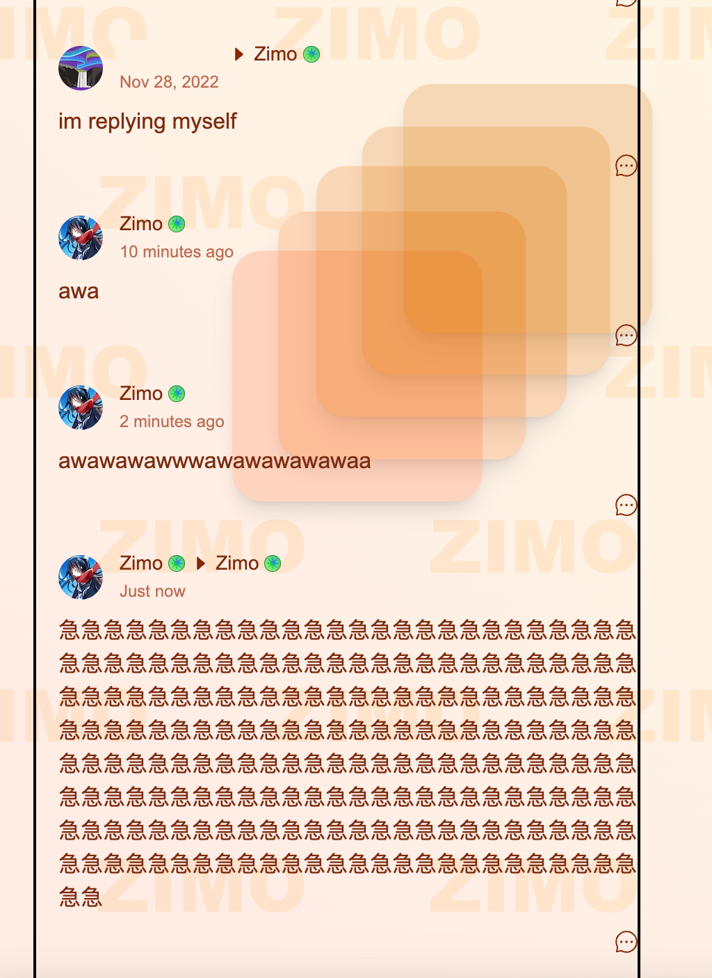
Testing the comment.
I felt accounts were to possess additional uses beyond syncing settings data. Commenting was thought of at Zimo Web’s inception; however, I deemed it immensely complicated and was at first reluctant to implement it. Its absence nevertheless rendered Zimo Web somewhat barren and soulless, compelling me to do a justice the accounts. Just remember I had to construct everything from the ground up, as only the barebones database was at my disposal. Hence, the commenting system was built entirely from scratch. Initially, I was content, until a kind and benevolent individual hacked my account. Resolving the security vulnerabilities and API issues took time, yet eventually, everything started to function properly and became significantly more structured. At first, the way comments functioned was a source of frustration for me. It posed a formidable challenge, but I persevered and ultimately overcame it.
October 4, 2023
Overhauled backend logic. Security got buffed.
September 30, 2023
Completed and tested the majority of the comment system.
September 20, 2023
Took a week-long break from making any changes to Zimo Web as I felt much needed to focus on other aspects of my life.
September 13, 2023
Finished the settings panel.
September 10, 2023
Completed the account management.
August 30, 2023
Background animations were mostly finalized.
Late Stages
By around mid-October, the bulk of functionality was finalized. Assuming that Zimo Web was transitioning into its later stages of development, I slowed down the progress, shifting my focus towards polishing pre-existing elements. At that time, both the homepage and the about page appeared somewhat minimal, so I opted for a simple solution and added a variety of panels to give them some substance. To prevent me from getting sued, it was a must to write some official terms and privacy policies. Utilizing some code from the blog page, I established a completely new section titled ‘management.’ Management featured two distinct themes – grayscale and colorful – as I had a hard time deciding which to use. I took this opportunity to make a theme-changing button with extremely satisfying animations.

Spinning spinning.
The End
By the time I wrote this article, Zimo Web is about ninety-eight percent complete. All that remains for me are some minor bug fixes and refining certain details.
What has become the reality... A blend of rough sketches and innumerable ideas has blossomed into reality; this was a day I hadn’t dared to anticipate. From the very first animated backgrounds to blog entries, projects, accounts, commenting, album, and the completion. From the very first animated backgrounds to the comprehensive implementation of blog entries, projects, user accounts, commenting features, albums, and ultimately, completion. There have been numerous instances when I felt overwhelmed, wishing to expedite the release of this ever-expanding project. There is the future that remained elusive, revealing itself only in its own time. But now, at last, I may pause and savor a moment of repose.
Welcome to Zimo Web.
Félicitations!