Unlimited Themes Update
Zimo
1 min read · May 25, 2024
Tags of this article:
Unlimited Themes Update
It’s been almost two months since the last update. After over a month of planning and coding, and two weeks of intensive development, I’m thrilled to introduce the ultimate power of creativity: the Theme Maker. This update brings forth an editor that empowers users to fully customize the appearance of Zimo Web. With the Theme Maker, users can adjust colors, create eye-catching backgrounds, and personalize the favicon. Building upon the foundation of nearly thirty existing themes in Zimo Web, this update opens the door to infinite possibilities, driven by the creative vision of you.
What’s New
Theme Maker
The Theme Maker, the dedicated editor for customized themes, is now available via the Design page. You can also access it directly.
This innovative tool supports the customization of themes, referred to as profiles within the editor. Users can adjust various aspects such as accent color, backdrop gradient, widgets, favicon, and more. Additionally, it offers functionalities like exporting and importing theme configuration files, analyzing themes from images, and more. All configurations can be made either through interactive sliders or numerical inputs. Make sure to check out the dedicated guide to fully understand the capabilities of the Theme Maker.
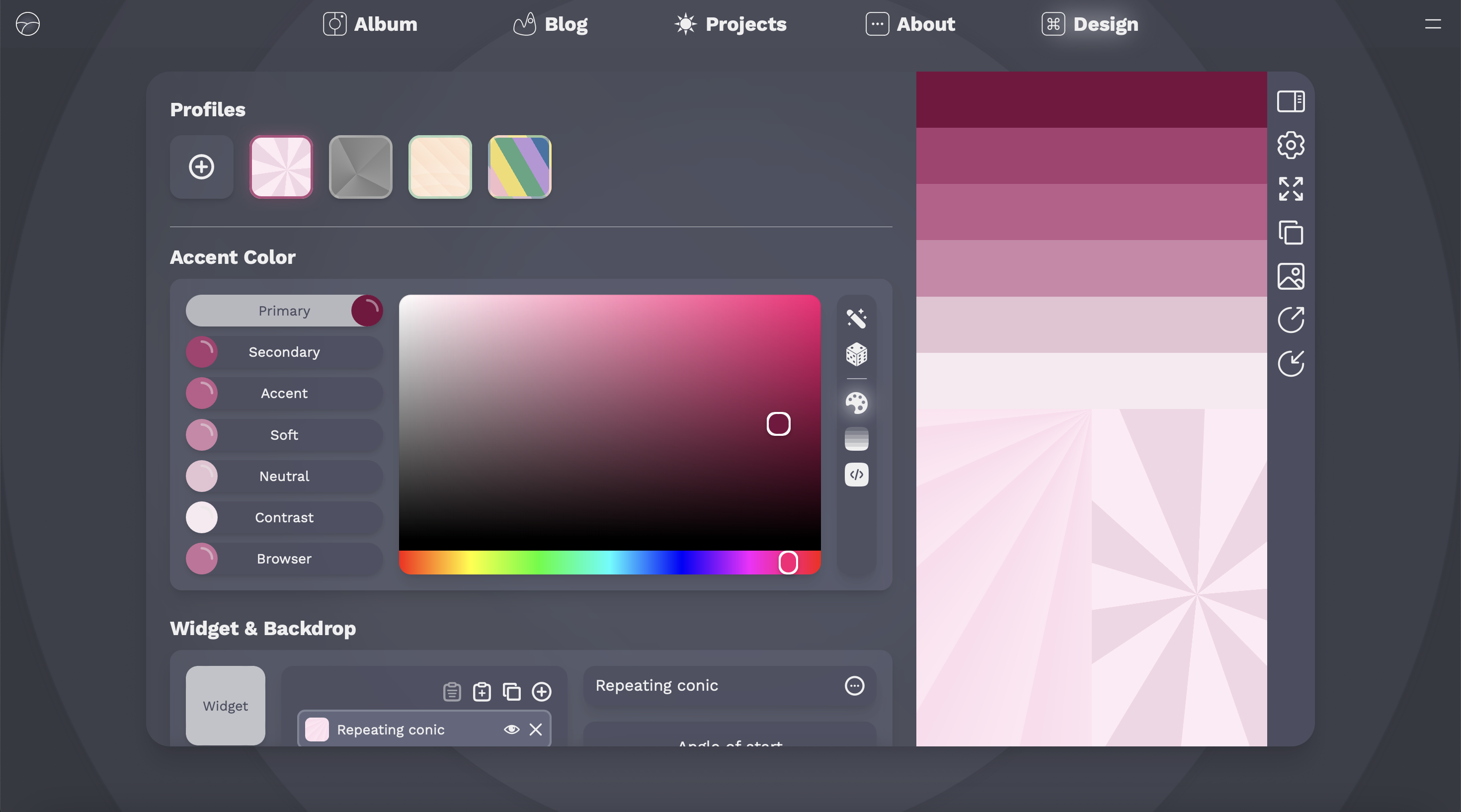
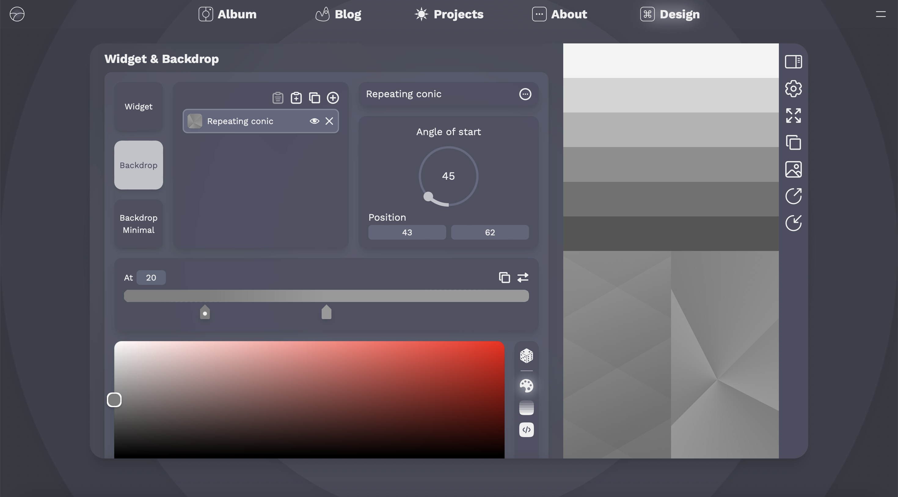
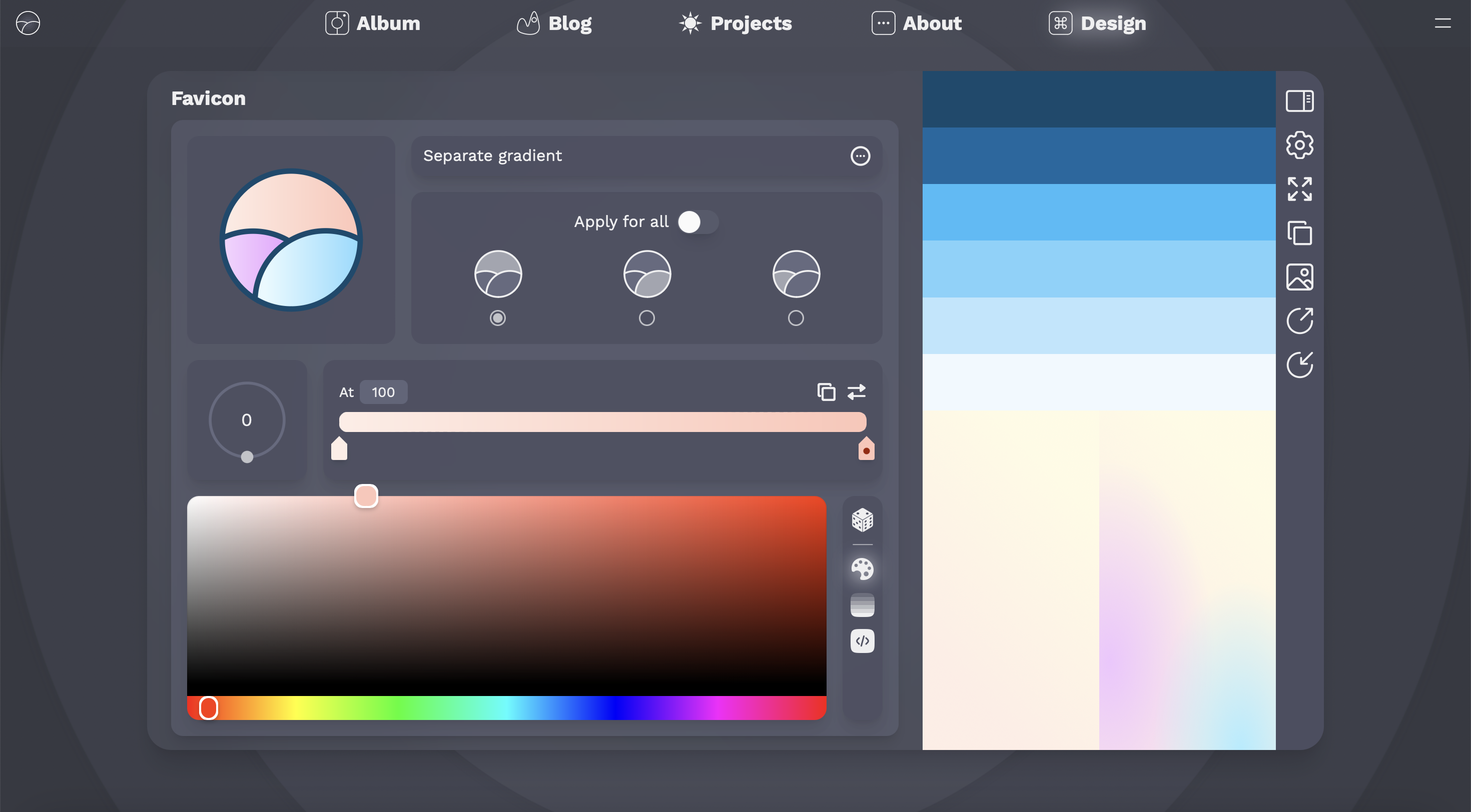
Theme Maker.
The Theme Maker is capable of producing themes of equal, if not superior, quality compared to the traditional preset themes offered by Zimo Web. In fact, from a technical standpoint, themes created using the Theme Maker share the same data structure as the traditional preset themes, meaning that they are one and the same. As both a proof of concept and a demonstration of the Theme Maker’s capabilities, four templates are already included by default, all crafted using the tools available within the Theme Maker. These four templates are: Lollipop, Cubistic, Oasis, and Spring Field.
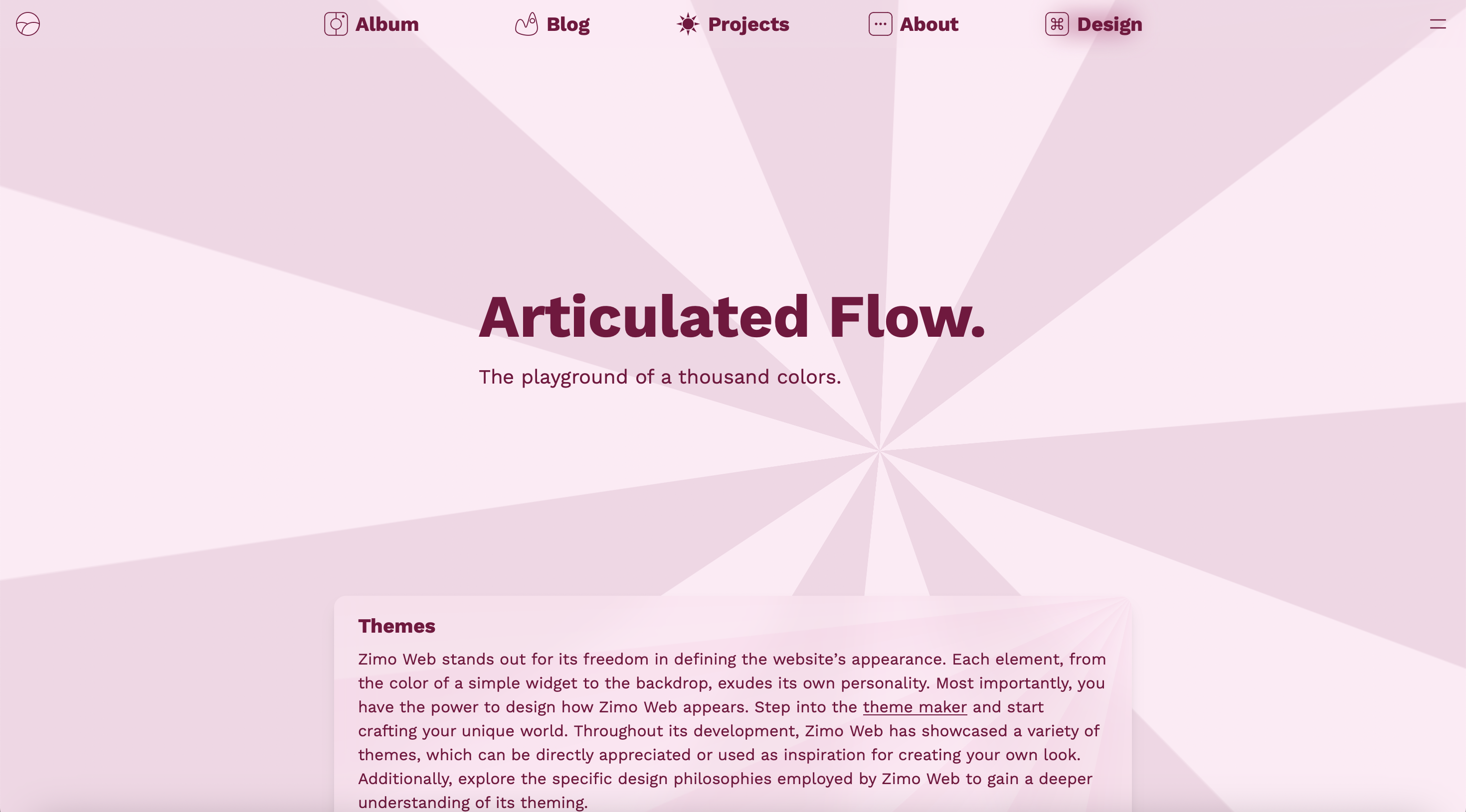
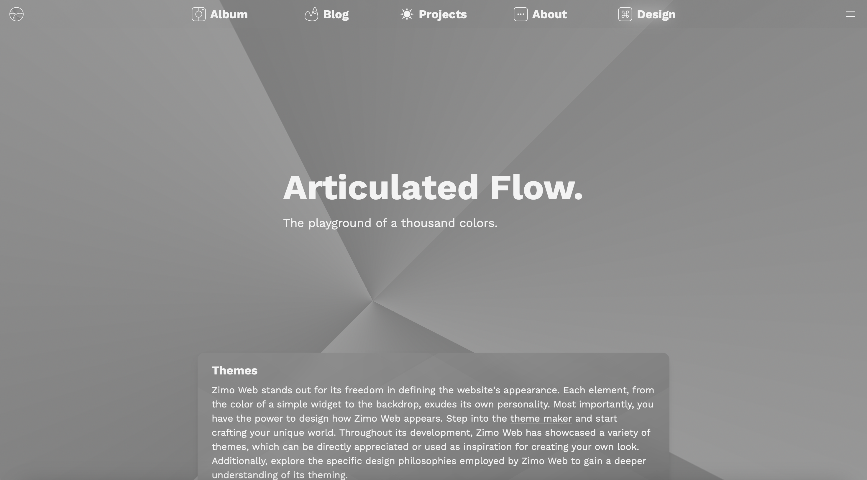
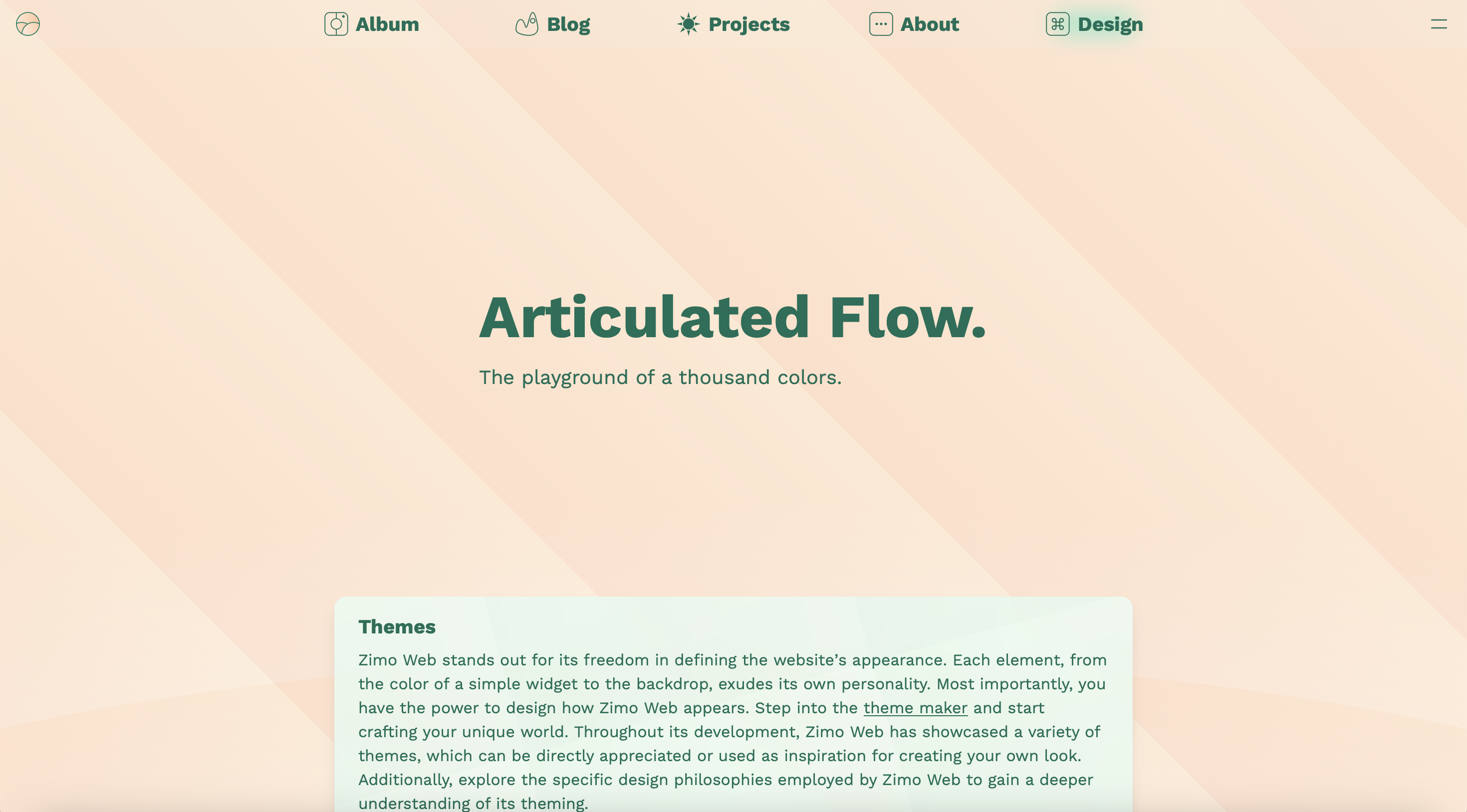
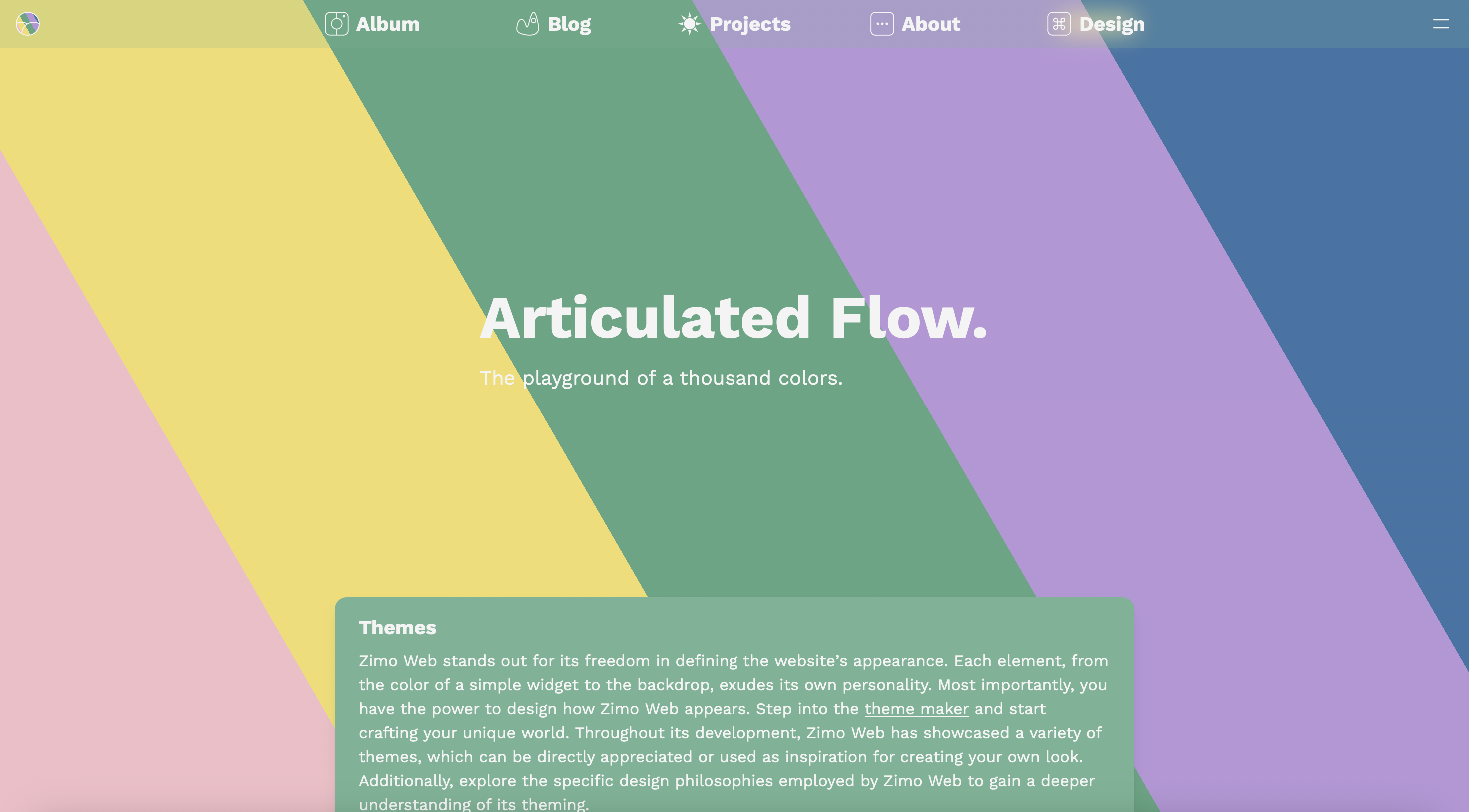
Lollipop template.
Penumbra Theme
In addition to the significant breakthrough of the Theme Maker, the Unlimited Themes Update introduces a new preset theme: the Penumbra theme. Serving as the default theme for the Theme Maker page, Penumbra offers a dark-toned aesthetic. Featuring carefully selected dark blueish hues and meticulously crafted backdrops, its simplicity perfectly complements the functionality of the Theme Maker.
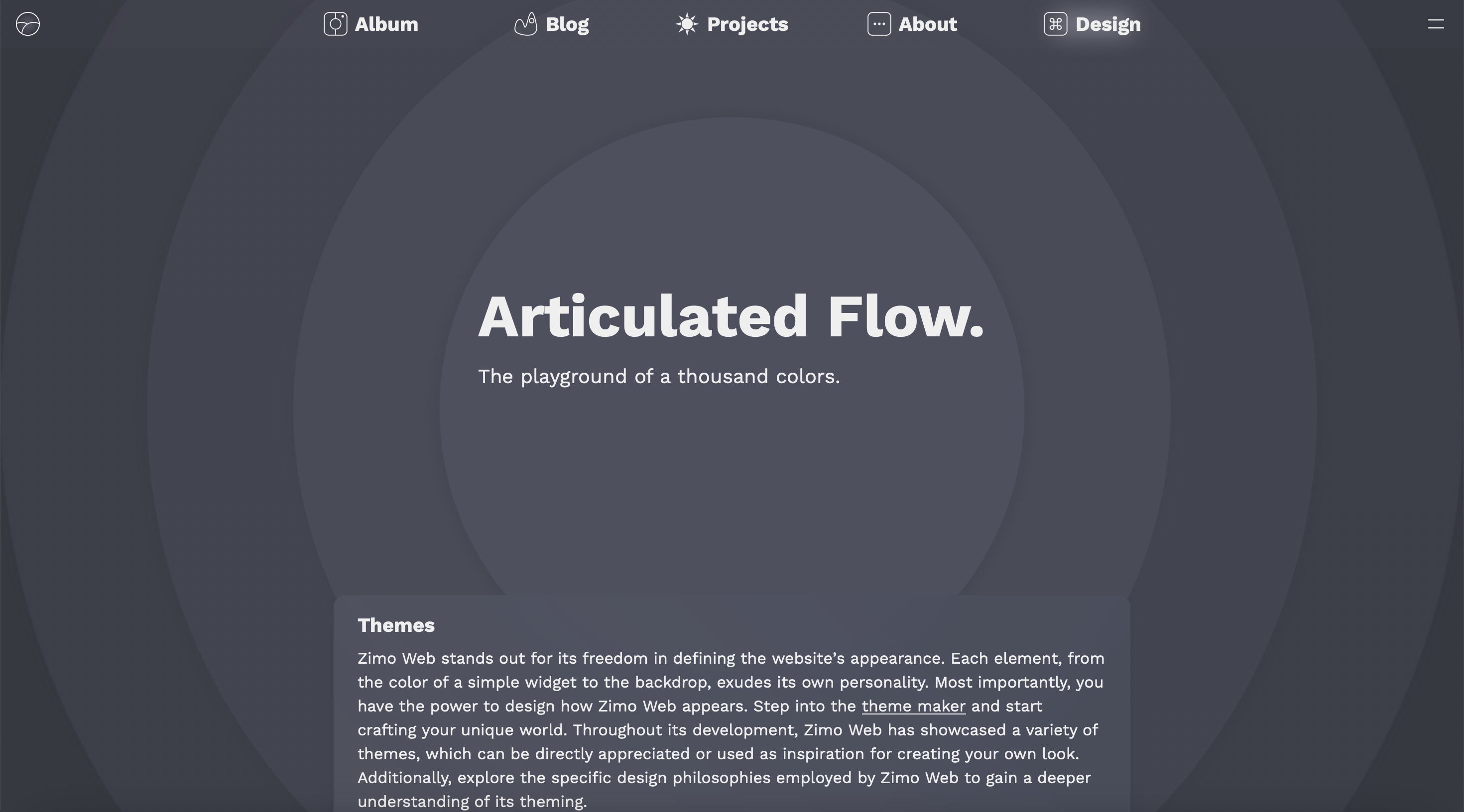
Penumbra theme.
Icon Changes
Icons for several buttons have been updated to improve clarity and consistency, particularly in terms of filled versus outlined styles and stroke thickness.
Technical
The data layer of themes has undergone a complete overhaul. Previously, themes were defined through a combination of React components, JSON-like configuration files, and CSS settings for color and backdrop configurations. However, in this update, the process has been significantly streamlined to enhance customization. Themes are now controlled directly by a series of configuration files that specify everything from colors and backgrounds to the favicon and other details.
All traditional preset themes have been converted to utilize this new data structure. Additionally, a parser has been developed to convert this JSON-like data into a browser-compatible format for rendering. As an example, the JSON configuration for the Vitreous theme can be expressed as follows:
{
  "palette": {
    "primary": [243, 242, 255],
    "light": [85, 66, 255],
    "saturated": [184, 198, 255],
    "middle": [145, 149, 255],
    "pastel": [95, 89, 255],
    "soft": [117, 107, 255],
    "page": [
      {
        "type": "repeating-linear-gradient",
        "angle": 315,
        "stops": [
          { "color": [0, 255, 255], "opacity": 0.1804, "at": 92 },
          { "color": [7, 58, 255], "opacity": 0, "at": 100 }
        ]
      },
      {
        "type": "repeating-radial-gradient",
        "sizeX": 75,
        "sizeY": 75,
        "posX": 238,
        "posY": 218,
        "stops": [
          { "color": [0, 255, 255], "opacity": 0.0706, "at": 30 },
          { "color": [7, 58, 255], "opacity": 0.0784, "at": 39 }
        ]
      },
      {
        "type": "radial-gradient",
        "sizeX": 99,
        "sizeY": 99,
        "posX": 109,
        "posY": 2,
        "stops": [
          { "color": [0, 201, 255], "opacity": 1, "at": 0 },
          { "color": [7, 58, 255], "opacity": 0, "at": 100 }
        ]
      },
      {
        "type": "radial-gradient",
        "sizeX": 99,
        "sizeY": 99,
        "posX": 21,
        "posY": 78,
        "stops": [
          { "color": [123, 0, 255], "opacity": 1, "at": 0 },
          { "color": [7, 58, 255], "opacity": 0, "at": 100 }
        ]
      },
      {
        "type": "radial-gradient",
        "sizeX": 160,
        "sizeY": 154,
        "posX": 0,
        "posY": 100,
        "stops": [
          { "color": [79, 53, 230], "opacity": 1, "at": 0 },
          { "color": [38, 96, 255], "opacity": 1, "at": 100 }
        ]
      }
    ],
    "pageMinimal": [
      {
        "type": "linear-gradient",
        "angle": 45,
        "stops": [
          { "color": [79, 53, 230], "opacity": 1, "at": 15 },
          { "color": [38, 96, 255], "opacity": 1, "at": 85 }
        ]
      }
    ],
    "widget": [
      {
        "type": "linear-gradient",
        "angle": 90,
        "stops": [
          {
            "color": [56, 109, 242],
            "opacity": 1,
            "isWidgetOpacity": true,
            "at": 15
          },
          {
            "color": [59, 104, 255],
            "opacity": 1,
            "isWidgetOpacity": true,
            "at": 85
          }
        ]
      }
    ]
  },
  "siteThemeColor": "#2660ff",
  "favicon": {
    "mode": "separate",
    "gradient": [
      {
        "stops": [
          { "color": "#883dff", "offset": 0 },
          { "color": "#3068ff", "offset": 1 }
        ]
      }
    ]
  }
}
Another technical change involves the rework of how favicons are rendered. Previously, they were rendered using individual SVG components. However, with the latest update, favicons now utilize the same data structure as described above, providing a more streamlined approach to their customization and rendering.
All of these changes collectively paved the way for the creation of the Theme Maker. By streamlining the theme definition process, revamping favicon rendering, and implementing a more customizable approach, Theme Maker was able to evolve from a mere concept to reality.


