Behind the Many Updates
Zimo
9 min read · Aug 5, 2024
Tags of this article:
It’s been almost a year since I started working on this website, and even longer if you count the moment I first conceived the idea for it. Over this time, many things have changed. Throughout the year, I’ve been constantly updating Zimo Web, focusing on enhancements beyond just the blog, album, and projects. While these sections have grown significantly in content, Zimo Web itself is more than just an information hub; it is a project that has received the most effort and dedication from me.
Zimo Web the Playground
Zimo Web started as a playground. Even if you took off every blog article, album post, project description, and piece of comment from the site, a robust skeleton would still remain. This skeletal foundation is made with a minimalist yet colorful design, frameworks for themes, notifications, commenting, and even an entire creative tool. Zimo Web is my playground for exploring the myriad of web technologies that once in a while intrigue me. I strive to make every piece of code elegant and to polish every feature until it reaches what I consider pure perfection; to me it’s a true passion project.
When Zimo Web was first publicly released, I was in a mental debate about the next steps. I considered focusing solely on content while shifting my technical efforts to other projects. However, this site had grown so significantly that it warranted further expansion, a quest for perfection. Technical updates became not just justified but necessary and glorified; they aligned with my Nietzschean philosophy of exerting power through passion and using that power for true actualization. Thus began my long journey with this site, consistently pushing updates and improvements.
A Humble Attempt
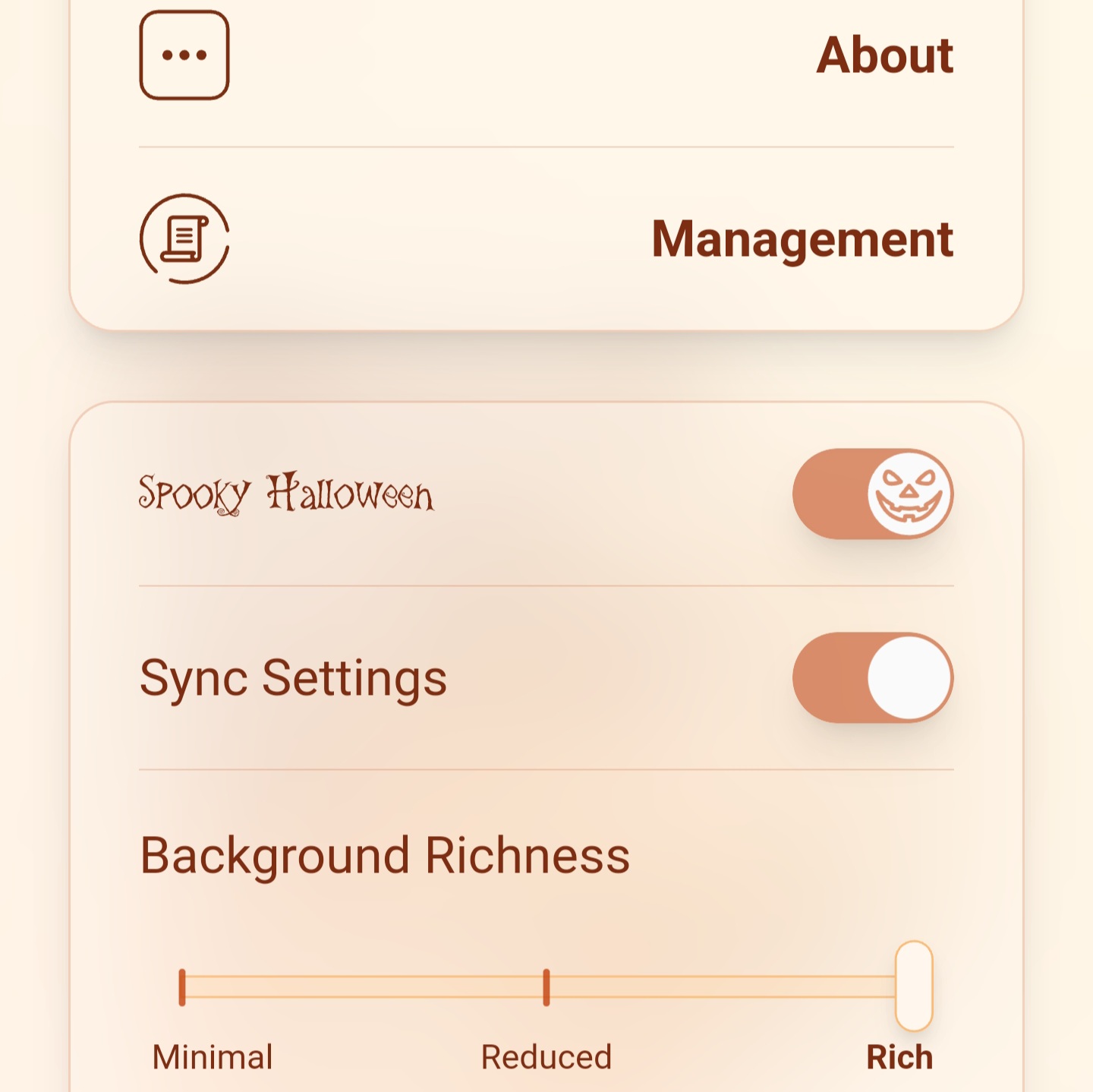
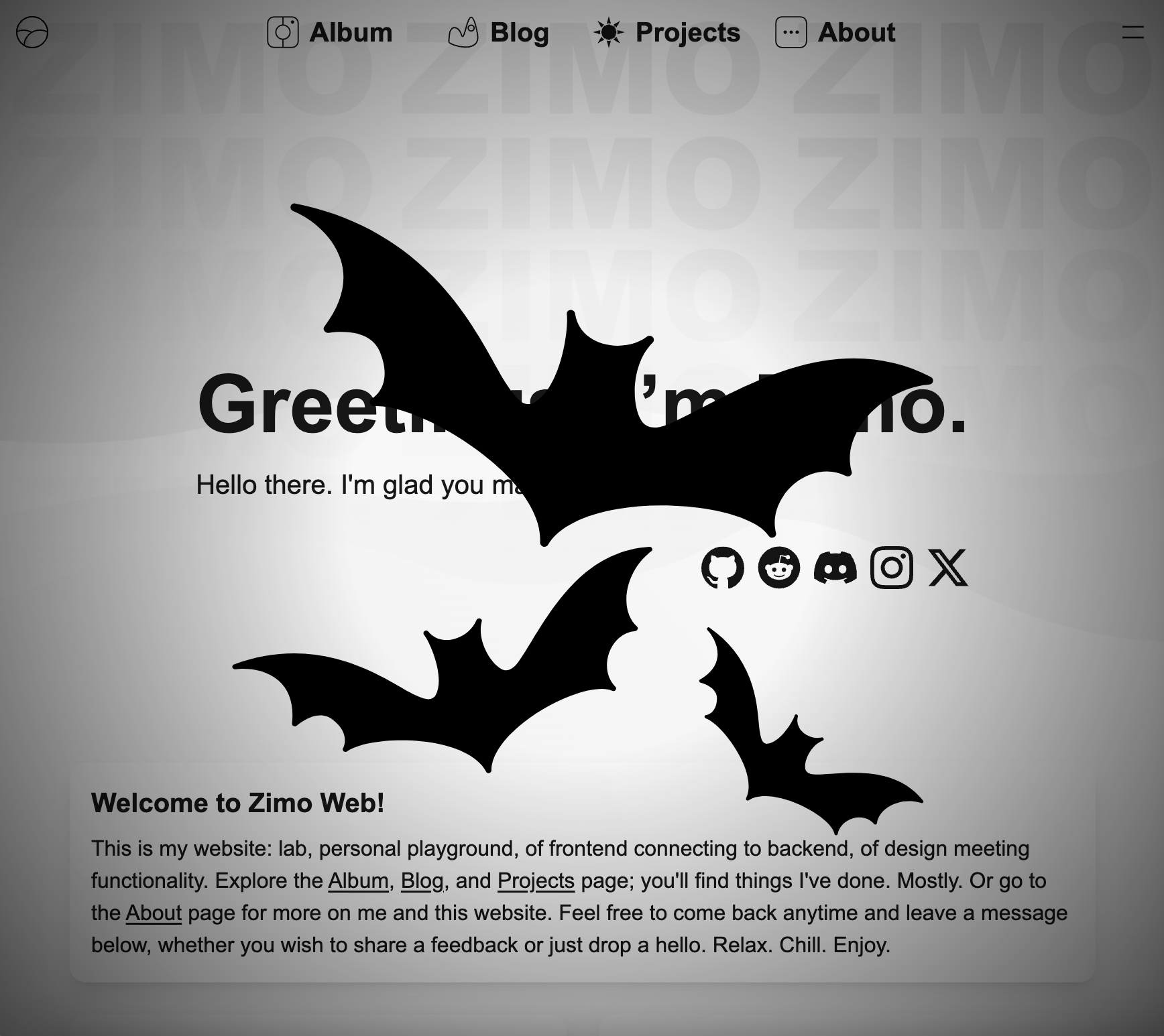
The first update to Zimo Web was quite underwhelming and poorly executed. The site had just launched days before Halloween, so I immediately began brainstorming ideas for a Halloween update. At the time, Zimo Web was quite rudimentary; theming wasn’t yet available. All I could do was make minor adjustments to the existing elements on the site. I changed the artwork at the center of the blog page’s animated background to some Halloween-themed artwork that I either created or sourced. To extend the Halloween atmosphere across the whole site, I implemented a site-wide visual effect that mildly jumpscared visitors. This turned out to be a terrible idea – even I was reluctant to enable it because it was too annoying. That update fell far short of my vision; I wanted the entire appearance of the site to change, with every bit of color reflecting the Halloween theme. This goal wasn’t achieved until much later, when a Halloween theme was finally added along with the other features from the initial attempt.


The Holy Grail
A month after the initial release, a major update was pushed that added the ability to change the site’s appearance, including color, tone, favicon, and animated backgrounds – essentially everything except the content and layout. Beneath this update, which introduced a couple of neat features, lay a complete rewrite of the website’s source code. This rewrite was prompted by the relatively new App Router of Next.js, the JavaScript framework on which Zimo Web is built. The web landscape is ever-changing, and the new framework had only been stable for less than six months. Given the positive feedback on the App Router, I decided to switch to it, even though it required a complete source rewrite. This transition also allowed me to add a feature I had long wanted: the ability to customize the site’s appearance to my liking.
Zimo Web began with its design. The animated backgrounds for the pages were directly converted from my earliest vision for this project, whether it’s the stacking camera lenses, the purple glowing orb, or the sun-shaped cog. Their color hues made each page unique and full of personality, and their shapes and designs subtly hinted at the overall theme of the page. Everything worked perfectly within the concept of simplicity in design. However, Zimo Web also embodies the idea of freedom; elegance might be the default choice, but it can never be the only option. In the earliest versions, the colors of widgets like blog article cards or the music player were hardcoded, and I enjoyed experimenting with different color schemes, such as an orange-tinted music player on a predominantly violet blog page. I also wanted to implement a unique dark mode for Zimo Web, since the animated backgrounds made traditional dark mode implementations impossible. These desires made the theming update even more significant.
This one update that introduced themes to Zimo Web was a technical feat. Themes with a high degree of freedom yet streamlined were uncommon on many websites and typically custom-made for each site’s unique content. Integrating this entire feature into the website was a significant achievement, embodying my goal of updates that present a challenge and offer substantial rewards. Themes also completely changed the direction of future updates, which became more focused on adding new themes. This update was one I was truly satisfied with, as it proved that my approach to technical updates was both feasible and impactful.
Satisfactory Machines
Reaching what felt like a milestone among the many updates, I turned my focus to refining subtle elements to achieve perfection. This period was dedicated to addressing longstanding awkward aspects of Zimo Web, emphasizing quality-of-life improvements that stand the test of time better than the flashiest features.
Notifications and alerts were present throughout Zimo Web, used for everything from prompting users to log in to signaling the sync status of settings. The previous implementation was a basic toast message that appeared near the bottom of the screen, which lacked flexibility and didn’t meet the site’s design standards. I took the time to implement a fully functional notification banner with swipe gesture controls and other expected features. This same swipe gesture was used to enhance the image viewer in the album, making it more fluid and intuitive. The banner includes a custom opacity control based on its position which somewhat resembles what you can find in platformer games. It also features a custom interface for adjusting the banner’s mode in the settings panel, complete with animations to improve the visuals and overall experience, although at first it used a slider much like many other settings entries. Several subtle improvements were made to nearly every component of Zimo Web, including minor design tweaks.
Meanwhile, some updates focused on a typically hidden aspect of Zimo Web. For last year’s Christmas, many enjoyed a decorate my tree game. I developed my own version with enhanced features, such as the ability to place decorations anywhere on the tree. Coding this feature was among the most enjoyable tasks; it felt like creating a game with its coordinate system and backend implementation, and remarkably, it was all completed in a single day. And the most intriguing part is where I come up with ideas for the various elements to be put onto a tree. Eventually the whole thing just worked together, and that was what led up to ultimate satisfaction.

Christmas tree.
Fun and Games
Adding themes to the website was a fun and creative process. Each theme started with a simple concept that evolved through color choices, eventually leading to animated backgrounds. I initially focused on dark themes like Midnight, Glitter, and Stars to balance the dark-to-light theme ratio. The Midnight theme was straightforward, imagined as a ball bouncing around, representing the moon itself dancing at midnight. However, its interpretation is open to the viewer. Glitter and Stars were particularly special as they showcased complex visual effects crafted solely with HTML and CSS, serving more as demonstrations of theming possibilities than as representations of specific ideas.
As the project progressed, the themes became more diverse. For instance, the Birthday theme, which I added just before my own birthday, was colorful and festive. I drew inspiration from the about page’s theme, which is quite the vanilla Zimo Web theme. The satisfying combination of dark pink and lime green became the base colors for the Birthday theme, complemented by handmade ‘18’ artwork.
Many themes were born from spontaneous ideas. The Bubbles theme, which became the default for the management page, originated simply because I wanted a blue theme. The Grass theme, introduced around New Year’s, was the result of me wanting to touch some grass after deciding that creating fireworks effects was too time-consuming. Seasonal themes like Halloween and Christmas also made their debut.
The Gold theme was an experiment with 3D libraries and a fulfilling of my desire for a gold theme to complement the blue one. Some themes, like Sky, Storm, and Pixelland, were based on a CSS technique enabling infinitely scrolling backgrounds. The Sky theme drew inspiration from Super Mario World’s level backgrounds, with clouds scrolling endlessly. The Storm theme was a recolored version of the Sky theme, influenced by a level in Mario Wonder, while Pixelland was inspired by Terraria’s title screen and the fact that I had always longed for a scrolling pixel theme. The name Pixelland came from that one Kevin MacLeod song of the same name. This theme became one of my favorites due to its beautiful execution.
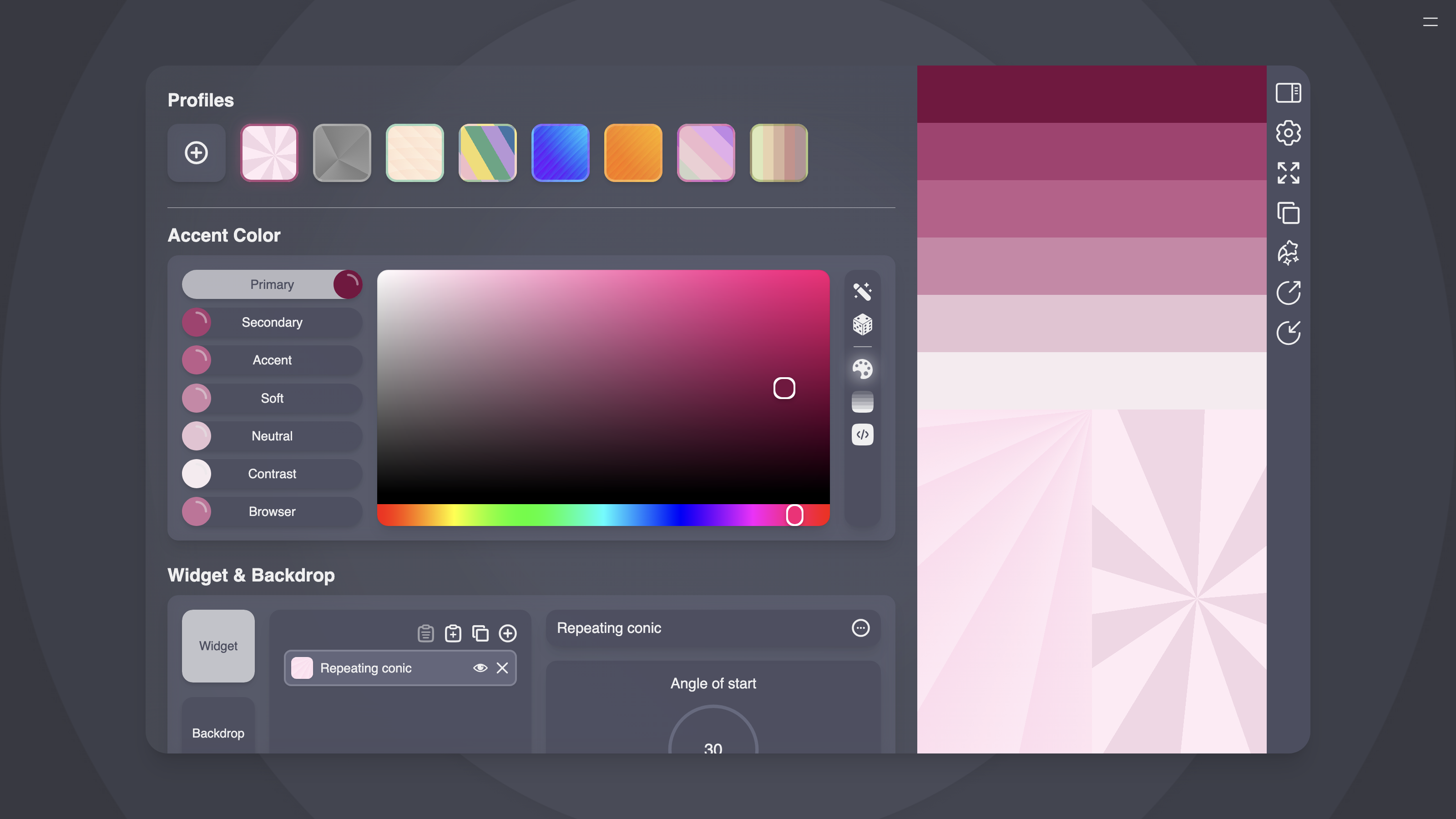
With dozens of themes added, I realized that Zimo Web might not need a specific purpose. The themes were valuable in their own right, whether for art, satisfaction, or sheer fun. Simultaneously, I recognized that Zimo Web had developed its own design language, blending a simple interface with rich animated backgrounds and a unified color scheme. I created a dedicated page to document these design elements, serving a greater purpose than mere demonstration. This effort culminated in the creation of the Theme Maker, a tool allowing users to create their own themes.
The development of the tool was an intense and rewarding effort. I had to completely redesign the data interface for themes to make them directly editable. As part of this process, I also revamped the favicons, shifting from hard-coded colors to parameter-based generation, which greatly enhanced customization options. Alongside the data structure overhaul, there was the challenge of front-end interface design. This led to several creative solutions for the Theme Maker, including an integrated color lookup panel in the sidebar, a sectioned layout, and an array of fancy ‘radio buttons’ for selecting categories.
And so the Theme Maker was born. Its finely crafted interface made creating a new theme as simple as a few clicks. The interface itself was a feat of graphical design and accessibility, delivering pure satisfaction. While the Theme Maker fully utilizes the CSS specification for gradients, it only functions within Zimo Web. Nonetheless, it brought immense enjoyment and pushed the website closer to perfection.

The single-page Theme Maker.
What Has Changed and What Hasn’t
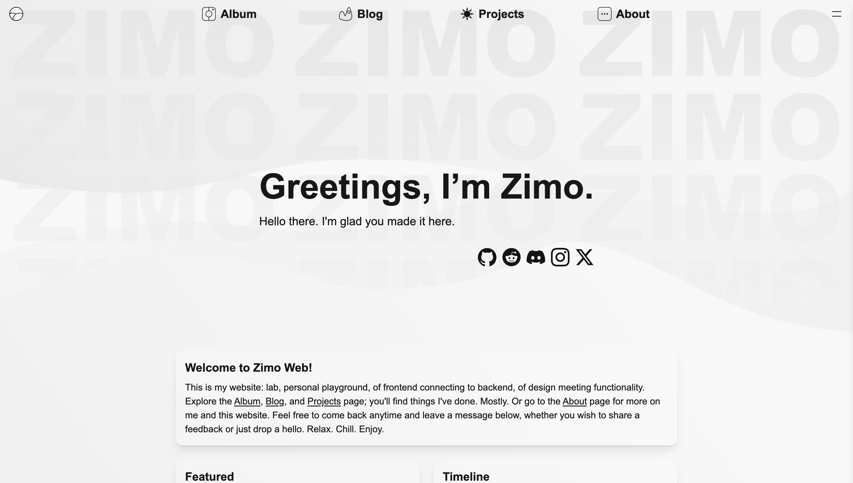
Occasionally, I open up multiple previous versions of Zimo Web: one from before the Theme Maker was introduced, another from before the themes were added, and even the first prototype with only animated backgrounds. It’s astonishing to see that the core aesthetic of the website has remained consistent since day one. At first glance, one might not notice any differences without a few extra clicks or a keen eye for detail. Despite this, I’ve dedicated countless hours and made hundreds of commits. What do these efforts represent? They embody the essence of these updates: subtle refinements toward perfection rather than major, groundbreaking changes. The general appearance has stayed true to the initial draft from day one, proving its timelessness. Beneath the surface, the accumulation of these subtle updates has resulted in a substantial yet seamless set of features.


Current Zimo Web.


