All-New Zimo Web Update
Zimo
4 min read · Nov 20, 2023
Tags of this article:
All-New Zimo Web
Presenting the All-New Zimo Web update. Refreshed, from ground up.
What’s New
The very most prominent feature is customizable themes for each page. In the past, themes were restricted to specific pages, with the violet palette exclusive to the blog page and the yellow-orange theme limited to the photos page. Now, thanks to a comprehensive rewrite of the website’s code, the theming and page logics are separated, allowing for universal theme application. With a simple click, you can transform the appearance of any page instantly.
To celebrate this breakthrough, two new dark themes are joining: the Midnight theme and the Glitter theme. Both offer a visually stunning experience and are more than pleasing to look at. Be sure to explore these new additions by just a tap of a button above.
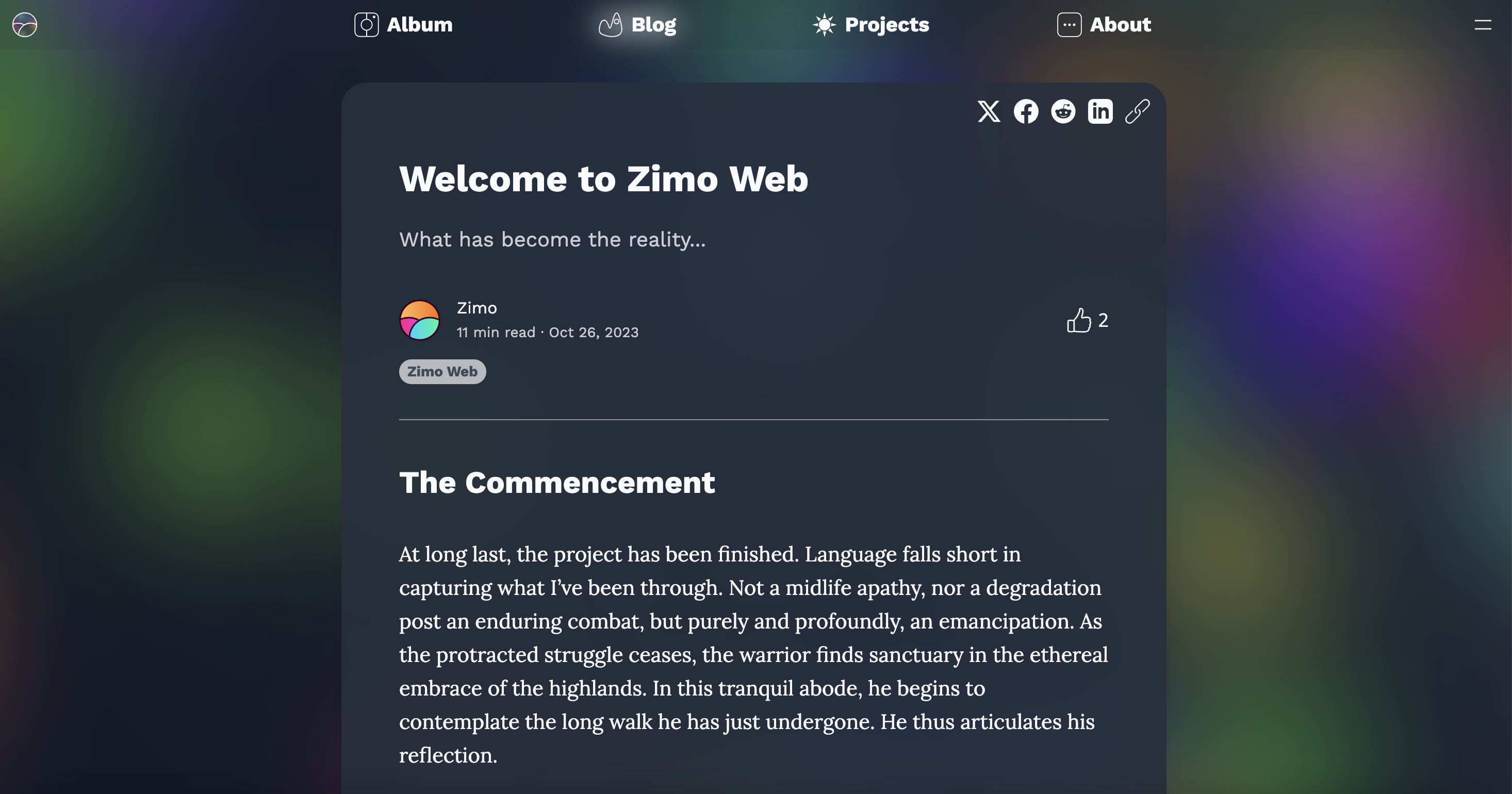
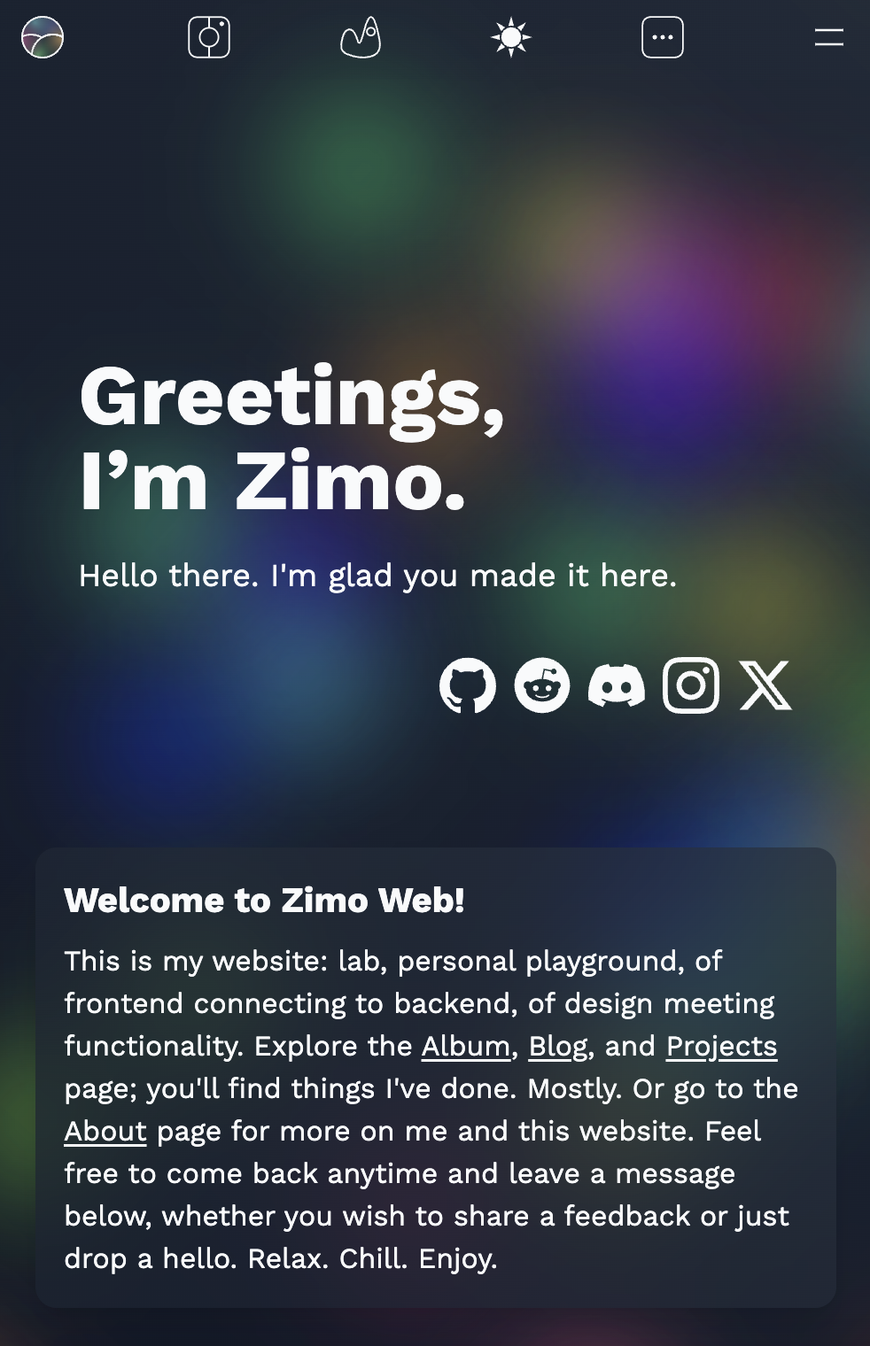
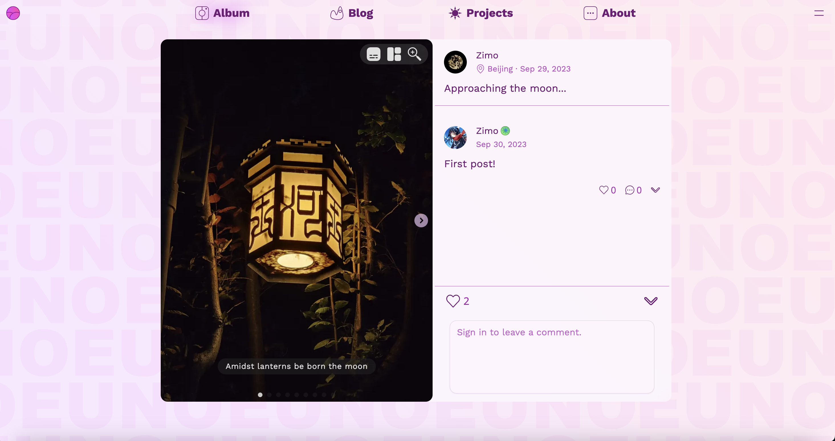
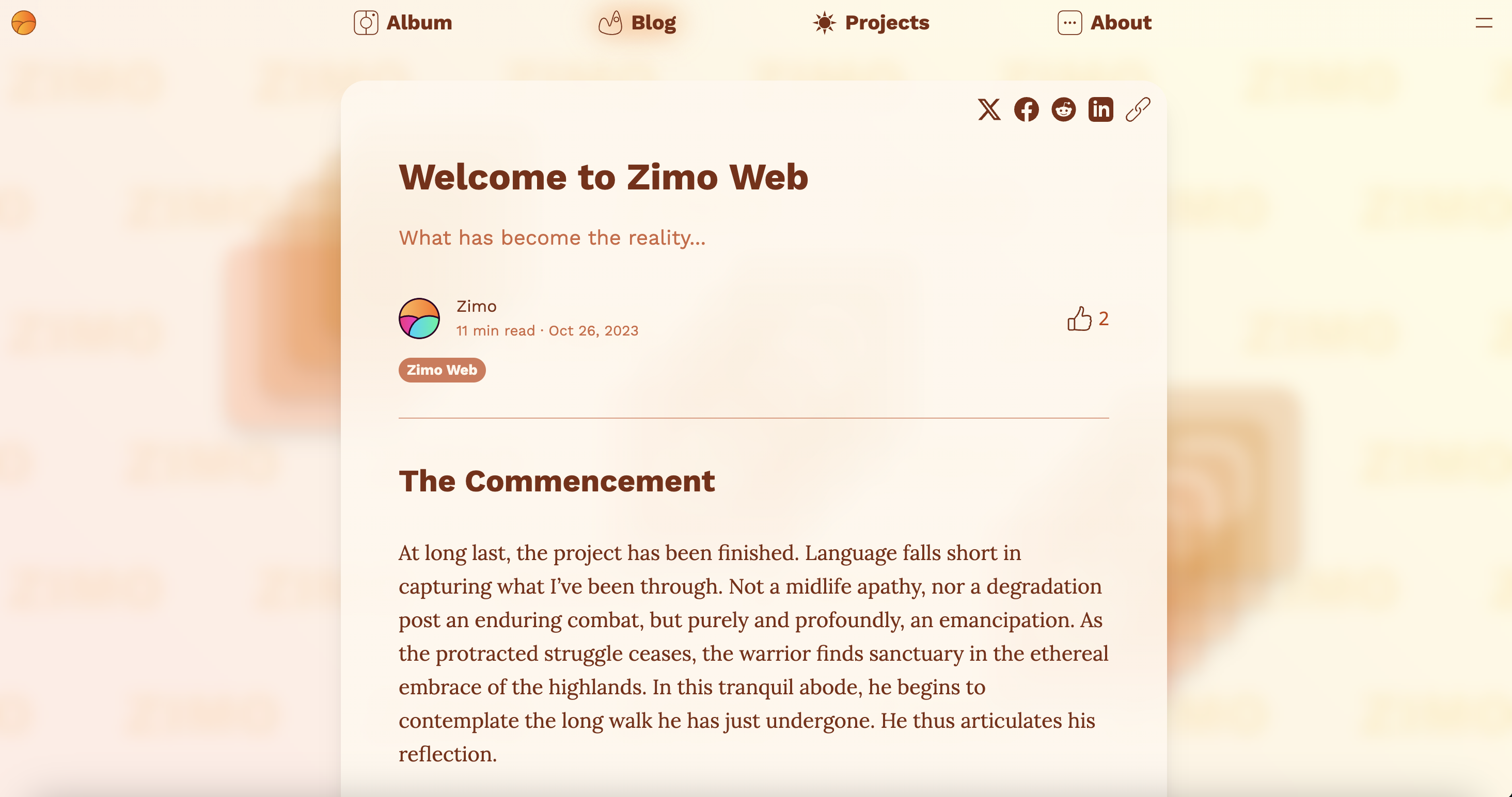
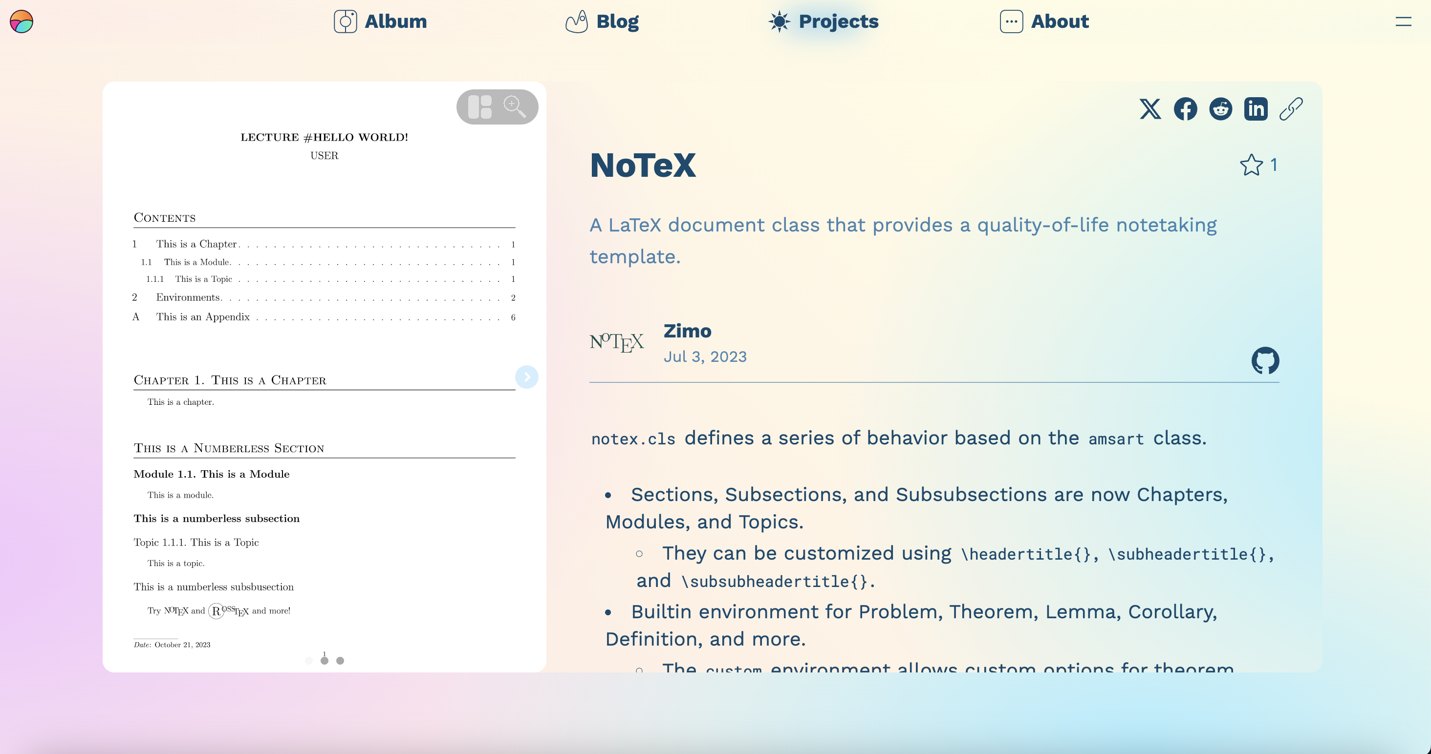
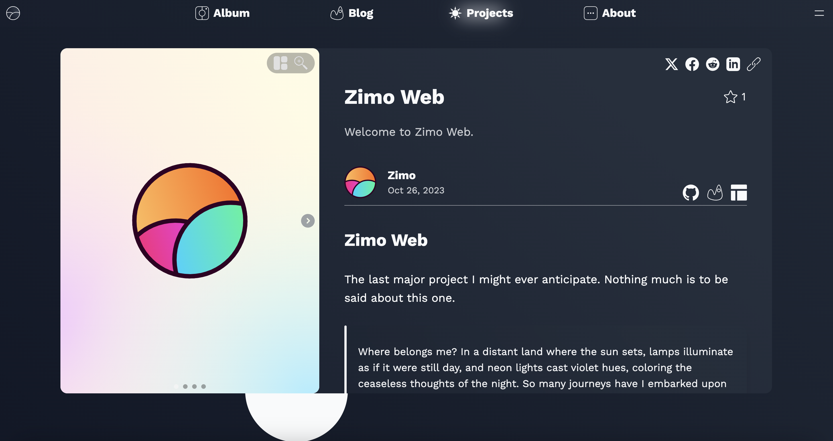
Glitter.
The Midnight theme is the first dark theme to be introduced, with every color selected to darken the tone while making every user interface as appealing as ever. The Glitter theme builds on top of the Midnight theme by adding a stunning animated background of colorful glitters.
Technical
The latest update is really my way of embracing the latest in web tech and cleaning up some old code that, to be honest, was a headache. It’s kinda funny how the JS community grows - it’s always a fast train forward, adopting new tools rather than fixing the existing ones. Just about a year ago, Next.js rolled out the new App Router that leverages React Server Components for server-only JavaScript execution. This basically cuts down the JavaScript load on the browser significantly. But it meant I had to rewrite all the code since App Router has its own way of doing things. Server Component is great every way, but it cannot use hooks, which are the core functionality that brings states and buttons. To maximize the potential of RSC is to play this jigsaw puzzle. I was playing with gratitude, though, as the App Router has been production-ready for a mere six months. We truly live in an age of wonders. But then I thought, why not fix up a few other quirks like the theming issue. And, oh, I’ve been planning to add a dark mode for ages, so guess what? I went ahead and added not one, but two dark modes :)
And here’s a little confession: when I first started working on this website, I knew absolutely nothing about React. I had to rely on some unique logic, and it’s a miracle it made it to the final production. Take, for example, the styling of the ‘window’ interface for album and project entries. Now, it’s styled as this
interface Props {
  imageData: ImagesData;
  display: ReactNode;
}

export default function WindowDisplay({ imageData, display }: Props) {
  const [widthRatio, heightRatio] = imageData.aspectRatio
    .split(":")
    .map(Number);

  return (
    <div className="h-full w-full flex rounded-xl overflow-hidden bg-widget-100">
      <div
        className="flex-grow-0 flex-shrink-0"
        style={{
          height: "100%",
          aspectRatio: `${widthRatio}/${heightRatio}`,
        }}
      >
        <ImageViewer
          {...imageData}
          useHFull={true}
          respectDefaultGridViewSettings={true}
        />
      </div>
      <div className="mx-1 flex-grow overflow-y-auto relative">{display}</div>
    </div>
  );
}
and this
.size {
  height: clamp(30vh, 70vw, 82vh);
  width: clamp(10rem, 90vw, 114vh);
}
The two together puts an image viewing box and a text box into that resizable window. That’s an easy and intuitive solution, but in the previous iteration of Zimo Web, it was pure abomination.
const [gridWidth, setGridWidth] = useState<number | null>(null);
const [gridHeight, setGridHeight] = useState<number | null >(null);
const { settings } = useSettings();

const [isCommentBoxExpanded, setIsCommentBoxExpanded] =
  useState <boolean>(true);

const textPartWidth = 400;
const minimumWidth = 0;

const handleResize = () => {
  const vh = window.innerHeight * 0.8;
  const vw = window.innerWidth * 0.64;
  const calculatedHeight = Math.min(vh, vw);

  const [widthRatio, heightRatio] = images.aspectRatio.split(":").map(Number);
  const aspectRatio = widthRatio / heightRatio;

  const fixedWidth = calculatedHeight * aspectRatio;
  const totalWidth = Math.max(fixedWidth + textPartWidth, minimumWidth);

  setGridWidth(totalWidth);
  setGridHeight(calculatedHeight);
};

useEffect(() => {
  handleResize();
  window.addEventListener("resize", handleResize);

  return () => {
    window.removeEventListener("resize", handleResize);
  };
}, []);

const parsedImage = imagesParser(images);

return (
  <div className="min-h-screen hidden items-center justify-center px-12 py-12 md:flex mb-3">
    <article
      className="flex rounded-xl bg-orange-50 overflow-hidden"
      style={{
        width: `${gridWidth}px`,
        height: `${gridHeight}px`,
      }}
    >
  /* ... */
);
That whole situation was a masterclass in inefficiency, and what’s even more horrifying is that I sometimes would just copy-paste code instead of reusing a component. That’s because back then I thought Kakashi sensei was cool, and I wanted to be a copy ninja just like him. The only problem is that I didn’t have a sharingan and had to rely on Command C and V. There were dozens of these code bloats scattered everywhere. But with this update, I’ve tackled each and every one of them for good. Now, the codebase is a breath of fresh air - hundred, if not thousand times more organized. If you really want to know about the painstaking technical stuff behind this update, be sure to check out the GitHub repo. Just don’t mind the commit messages.
All said, I’m more than satisfied with how the things turned out, especially with the new theming system. I wonder what will come within a week.
The first time news of Geometry Dash 2.2 coming out got confirmed, Zimo Web hadn’t even been a concept. A few months later, Zimo Web has undergone its complete code rewrite, yet the game is nowhere to be seen. RobTop has promised that Geometry Dash 2.2 will release within this month. Let’s hope for him the best and get hyped up for the update. Meanwhile, stay chill.
awa


